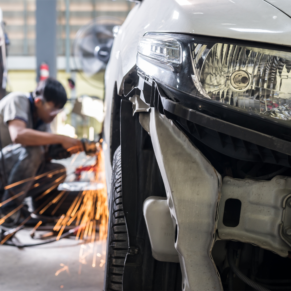
About Quirk Auto Body
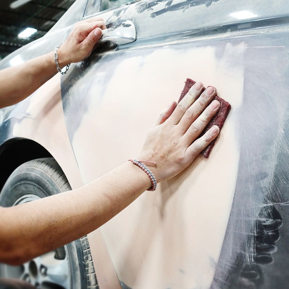
At Quirk Auto Body, our mission is to provide the highest quality, people-first collision repair experience
built on honesty, transparency, and reliability. We focus on the finer details others might overlook
from expert color matching that accounts for natural paint fade to precision alignment that restores your
vehicle’s original fit and finish. Combining decades of hands-on expertise with state-of-the-art equipment,
we ensure every repair meets our exacting standards so your vehicle leaves our shop looking and performing
like new.
Our Commitment to Excellence
From minor dents to major collision repairs, we treat every vehicle as if it were our own.
Our team blends craftsmanship with advanced technology to restore not only the look but the safety and
integrity of your car. When you choose Quirk Auto Body, you’re choosing peace of mind, attention to detail,
and a repair you can trust.
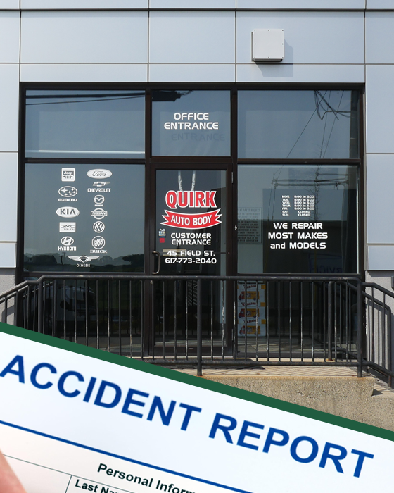
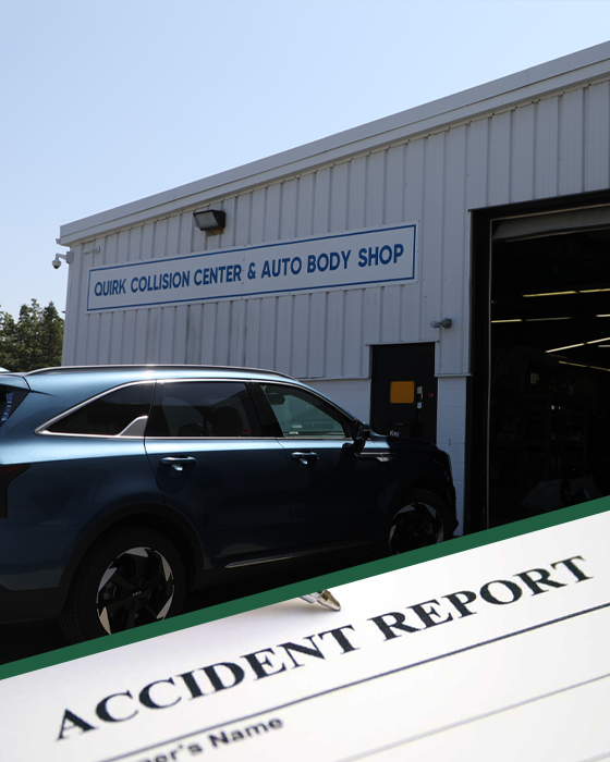
Accident Forms
Navigating through the aftermath of an accident can be overwhelming, but we’re here to assist you. To streamline the initial reporting process, we provide a downloadable Accident Report Form to help you document essential details such as the date, time, and circumstances of the incident. Complete the form at your earliest convenience, and feel free to reach out to our team for assistance.